Star Counts Lied to Us: We Gave 74 Open Source Projects a Graph Database Health Check
 When you pick an open source project on GitHub, what do you look at first? For most people, the answer is Star count. But can Star count really tell you whether a project is healthy and worth relying on long-term?
Ollama has 250K Stars on GitHub — it’s the hottest local LLM tool out there. If you had to guess its community health ranking, where would you place it?
Answer: #68 out of 74 projects, in the red zone.
Monthly active users dropped from a peak of 1,128 to just 150. Core developers shrank from 102 down to as low as 13, scoring only 8.8 on personnel retention (out of 100) — almost no one stayed. Meanwhile, vLLM in the same space has less than half of Ollama’s Stars but ranks #7 in health, with a maintenance score of 90.6 and four consecutive years of positive talent growth.
A 250K-Star project is less healthy than a 50K-Star one? This isn’t an outlier — it’s a pattern we found repeatedly across 74 projects. Star count measures “how many people passed by,” not “how many people stayed.”
All graph data storage, querying, and analysis in this study were powered by NeuG embedded graph database.
Why We Did This
How do you actually measure the health of an open source community? Stars, Forks, commit frequency — these cross-sectional counts describe “how much happened,” not “whether the community structure is healthy.” Some projects looked their most “prosperous” with great Star and commit numbers, monthly active users exceeding 2,000 — only to drop to single digits two years later. Cross-sectional counts never warned of these collapses.
Especially under the AI wave, hype makes judgment harder. When an LLM repository sees 60K events and tens of thousands of Stars in its first month, every cross-sectional metric screams “boom” — but three months later it may be down to double-digit activity. Hype creates the illusion that “everything is fine,” masking the fact that the collaboration network is unraveling.
We needed an evaluation method that cuts through the hype — not asking “how many events happened,” but asking “whether the collaboration network’s topology is healthy.”
So we did this: we modeled GitHub collaboration behavior as a time-evolving graph network and gave 74 representative open source projects a “health check” across four dimensions: maintainer burnout risk, newcomer onboarding path, community interaction quality, and personnel flow trends. Covering 10 tracks including AI/ML, programming languages, front-end, cloud-native, and big data, spanning 2021-2025 across 60 months. All graph data storage and analysis were powered by NeuG embedded graph database, whose high-performance analytics engine made bulk k-core decomposition, BFS shortest path, and clustering coefficient computation across thousands of monthly graph snapshots possible.
Five Findings You Might Not Expect
Finding 1: The Most-Starred Projects Are Often Not the Healthiest
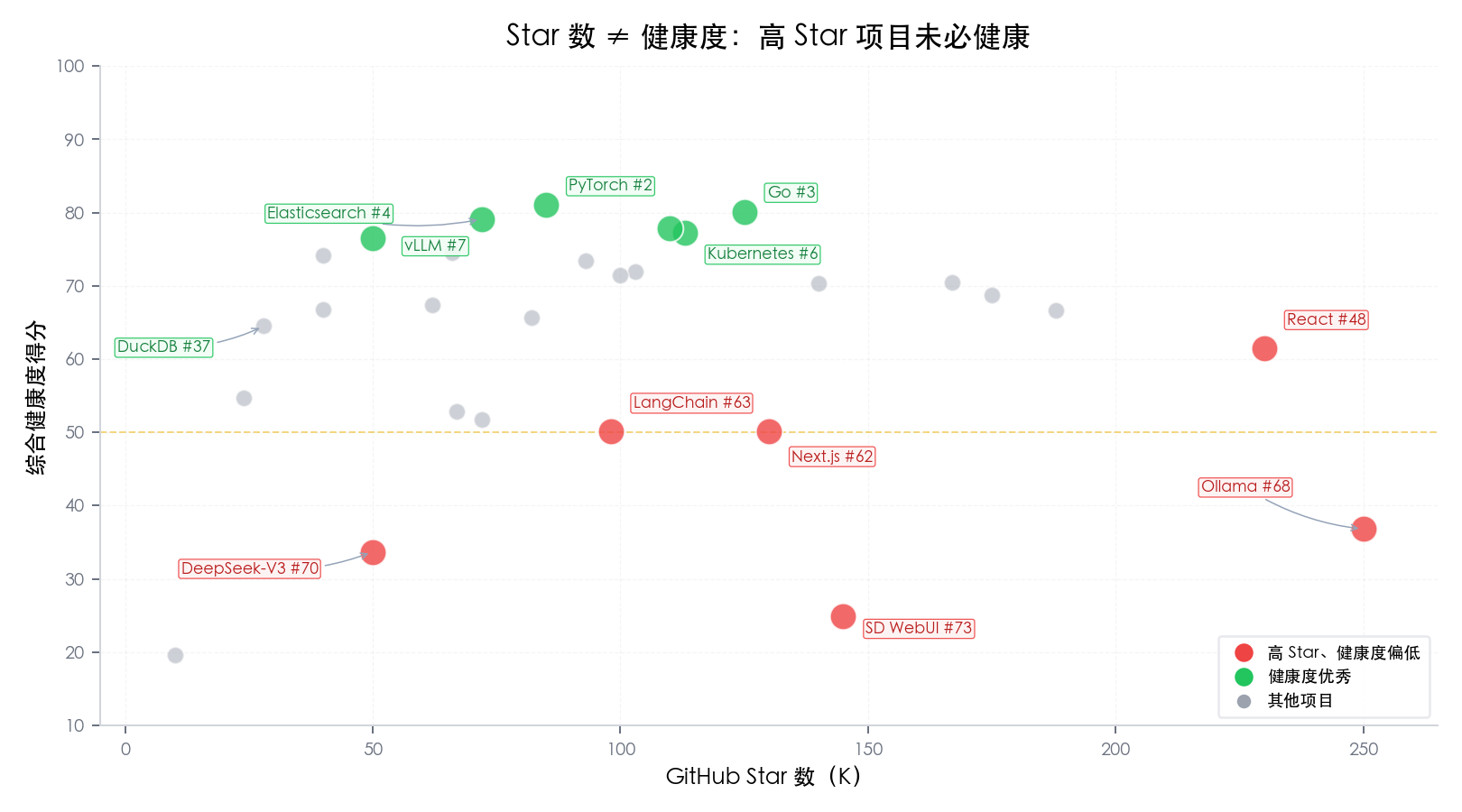
Ollama (250K Stars, #68), Next.js (130K Stars, #62), React (230K Stars, #48) — these household names rank in the mid-to-lower tier for health. Instead, “quietly doing the work” projects like Elasticsearch (#4), vLLM (#7), and DuckDB (#37, perfect atmosphere score) perform best.
The key signal isn’t “how many people visited,” but “whether the collaboration network is tight and whether talent stays.”
Finding 2: LLM Model Repositories Score Universally Low
baichuan2 (19.6), deepseek-v3 (33.7), yi (28.5), chatglm3 (48.1) — the LLM track averages only 39.9, with 5 out of 6 projects scoring below 50, the lowest among all tracks.
Two notable patterns in the data:
1. “Peak at launch” exponential decay: baichuan2 started with 2,925 events in month one, dropping to just 43 after 12 months; yi went from 5,908 to 239 after 9 months; deepseek-v3 plummeted from a peak of 61,174 to 309 after 13 months. Tool projects like vLLM do the opposite — growing steadily from 3,574 to 12,614, getting more alive the more they’re used.
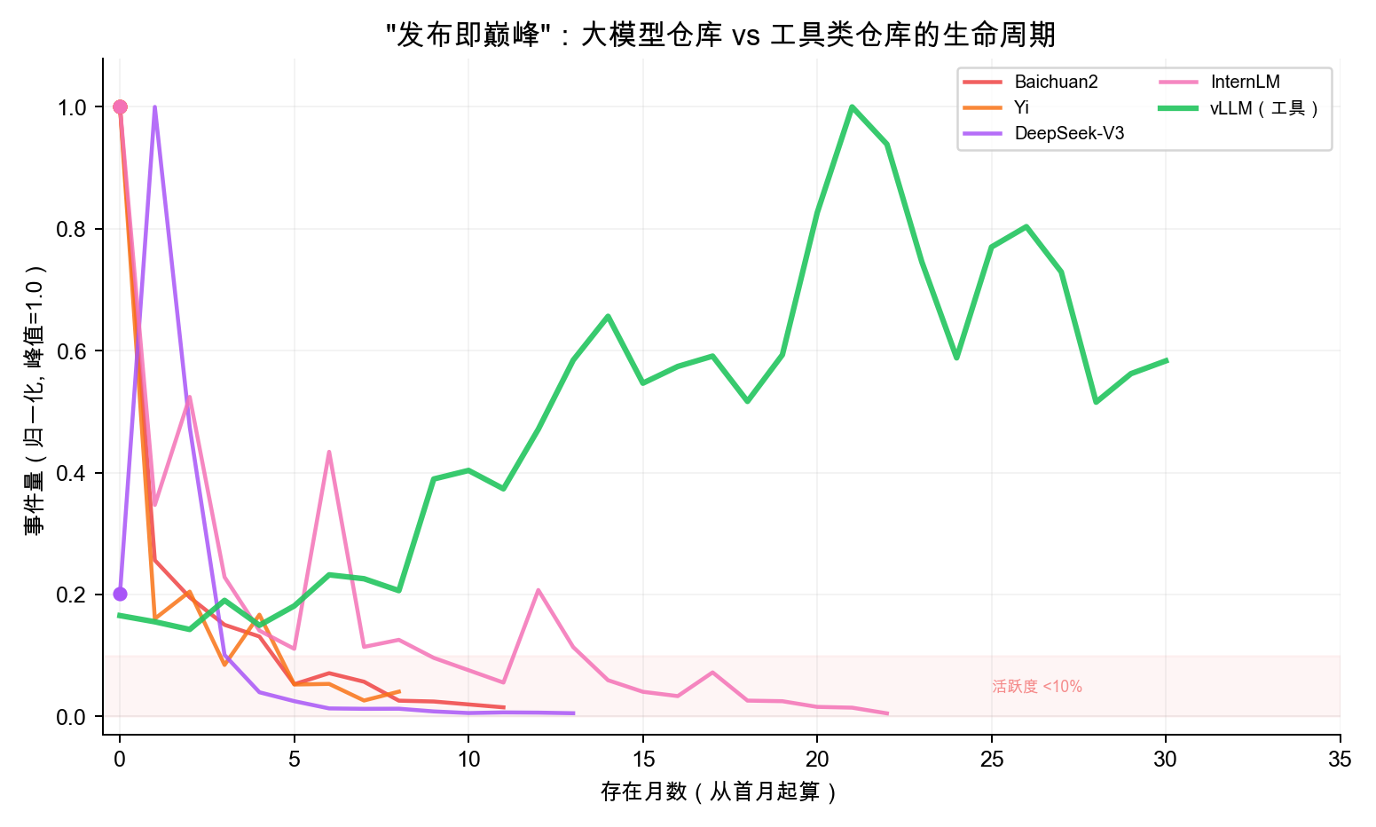
2. Near-total core team turnover: The initial core developers of all 6 LLM repositories almost entirely turned over. baichuan2 shrank from 41 core contributors to 2, chatglm3 from 20 to 2 — mostly new faces.
A possible explanation: LLM GitHub repositories are closer to “model launch pages” than long-term collaborative community projects — after the model ships, R&D focus naturally shifts elsewhere, and the real community ecosystem (fine-tuning discussions, weight distribution) happens more on platforms like HuggingFace. This also means tens of thousands of Stars and events in the first month reflect attention rather than community stickiness, and when making technology choices, you should be aware of the gap between hype and long-term community activity.
Finding 3: Maintainer Health and Personnel Flow Are the “Twin Pillars”
Across the 74 projects, the two dimensions most correlated with total score are maintainer health (r=0.817) and personnel flow (r=0.755), with newcomer friendliness close behind (r=0.578). Maintainers doing well → talent stays → community is healthy.
Finding 4: The Closer to Infrastructure, the More Cycle-Resistant the Community
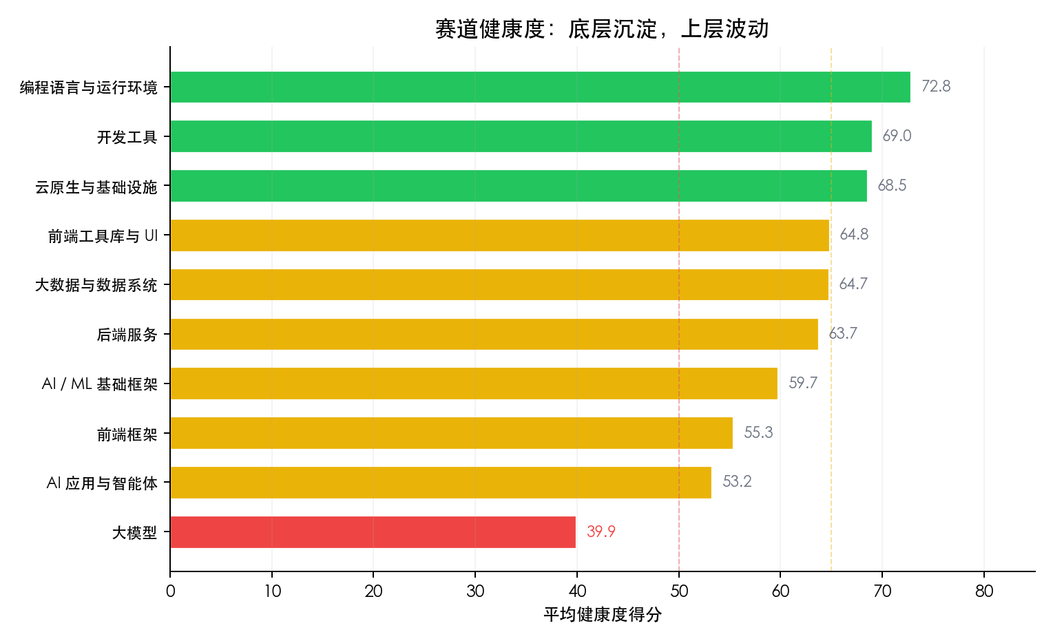
The AI ecosystem shows a clear three-tier gradient — infrastructure frameworks (PyTorch/Transformers, avg 59.7) > application orchestration layer (LangChain/AutoGen, 53.2) > model release layer (39.9). Infrastructure has technical moats for protection; the orchestration layer is too easily replaceable, and once the hype fades, people scatter.
Finding 5: “False Prosperity” Has a Mathematical Signature — High Event Volume + Low Clustering Coefficient
LangChain peaked at 2,022 monthly active users and 14,796 monthly events — two years later, MAU dropped to 173 (↓91%). AutoGen’s change was even more dramatic, dropping from 328 to 2 users (↓99.4%), with the collaboration network’s clustering coefficient falling to 0.000. When the Star chart looks fine but the network clustering coefficient keeps declining, it means collaboration relationships are loosening and deserves attention.
Counter-Intuitive Cases: Three Comparisons You Didn’t See Coming
1. Ollama vs vLLM: Ice and Fire in the Same Track
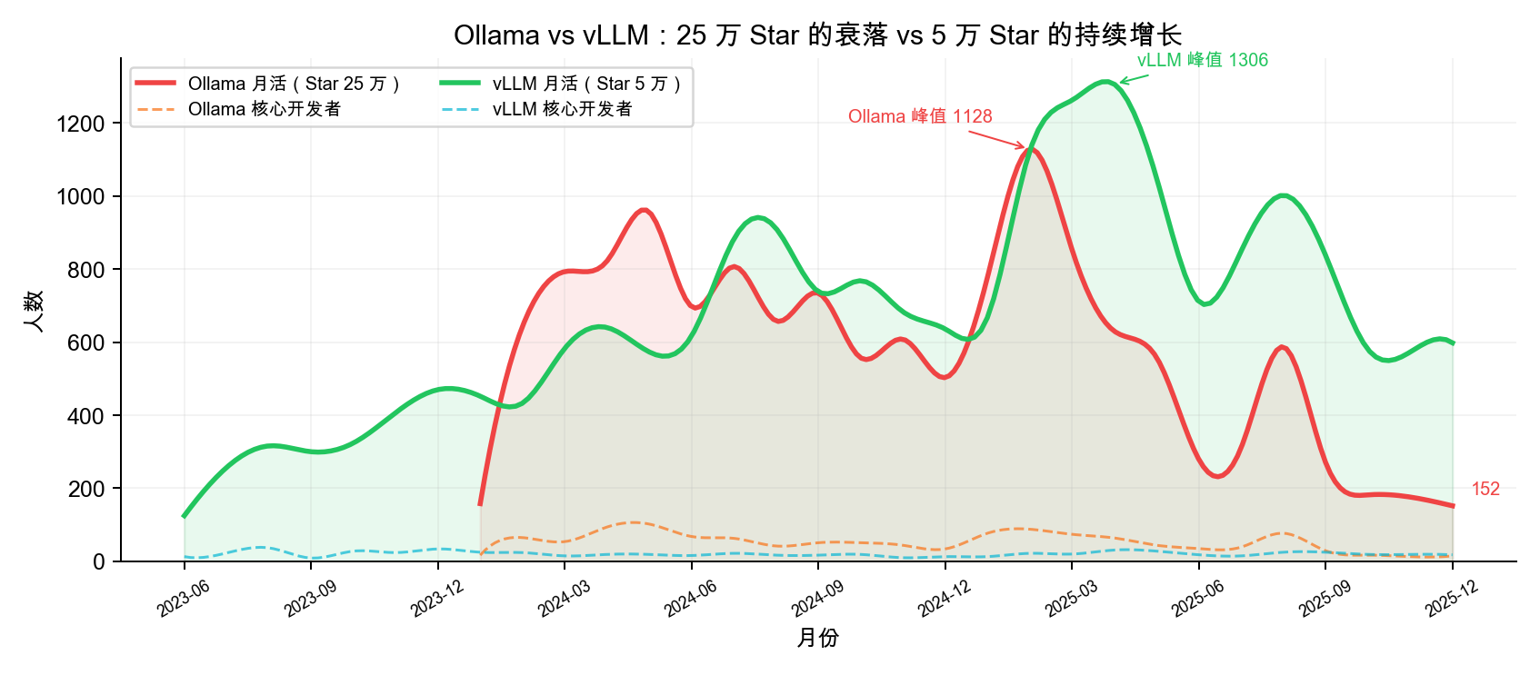
Both projects are LLM inference tools — the former for individual users (local deployment), the latter for enterprises (high-throughput inference).
| Ollama | vLLM | |
|---|---|---|
| GitHub Star | ~250K | ~50K |
| Overall Rank | #68 (36.8) | #7 (76.5) |
| Maintainer Health | 34.0 | 90.6 |
| Personnel Flow | 8.8 | 84.5 |
| Burnout Risk | High | Healthy |
| MAU Peak→Trough | 1,128 → 150 (-87%) | Peak at 1,306 |
| Core Developers | 102 → 24 (once down to 13) | Stable 15-30 |
| Talent Trend | 2025 -9.6%, 2026 -83.3% | 4 consecutive years of positive growth |
What’s Ollama’s challenge? A personnel flow score of 8.8 indicates insufficient contributor retention. The rapid influx of +100% in 2023 turned into a massive outflow of -83.3% by 2026. A maintainer health score of 34.0 reflects significant core team contraction with high burnout risk.
In contrast, vLLM scores 90.6 on maintenance, maintains a stable core developer base of 15-30 people long-term, and has seen positive talent growth for 4 consecutive years (though the growth rate is slowing, it remains positive). This is a textbook case of “healthy sustainable growth.”
Takeaway: This is a noteworthy “hype vs health misalignment” phenomenon — Star count measures “how many people pay attention,” while health measures “how many people keep participating.” A project can have 250K Stars but only 24 core developers — the higher the attention, the easier this gap is to overlook. When making technology choices in the AI track, we recommend checking whether Star growth rate matches core contributor growth rate.
2. OpenClaw vs AutoGPT: After Lightning-Fast Rise, Landing or Crashing?
OpenClaw shot to #1 overall (92.4 points) with just 2 months of data. Let’s put it alongside another project that once had a “lightning-fast rise” — AutoGPT from 2023.
| OpenClaw (2026) | AutoGPT (2023) | |
|---|---|---|
| Explosion Month Events | 100,277 | 82,469 |
| Explosion Month MAU | 3,382 | 1,985 |
| Explosion Month Core Devs | 25 | 108 |
| Next Month MAU | 2,349 (-30.5%) | 849 (-57%) |
AutoGPT’s story is a successful “landing” case. After its April 2023 explosion (82K events), MAU dropped from 1,985 to 849 (-57%) the next month, and core developers plummeted from 108 to 14 — but it didn’t die. It stabilized at 3,000-6,000 monthly events in 2024-2025, with talent flow recovering from -33% bleeding to +9.4% and +22.4% positive growth. AutoGPT spent two years rebuilding a smaller but healthier community and currently ranks #22.
OpenClaw now stands at the same crossroads. February’s 100K events and 3,382 MAU represent the largest single-month surge among all 74 projects. And OpenClaw has a feature AutoGPT didn’t have: AI Agents deeply embedded in the development workflow. Bots like greptile-apps[bot] and openclaw-barnacle[bot] consistently rank among the top core contributors — a pattern that barely exists in traditional projects. However, OpenClaw’s March MAU dropped to 2,349, a 30.5% decline. Historically, AutoGPT experienced a 57% MAU drop after a similar-scale explosion; while OpenClaw’s decline is milder, it hasn’t escaped this pattern either.
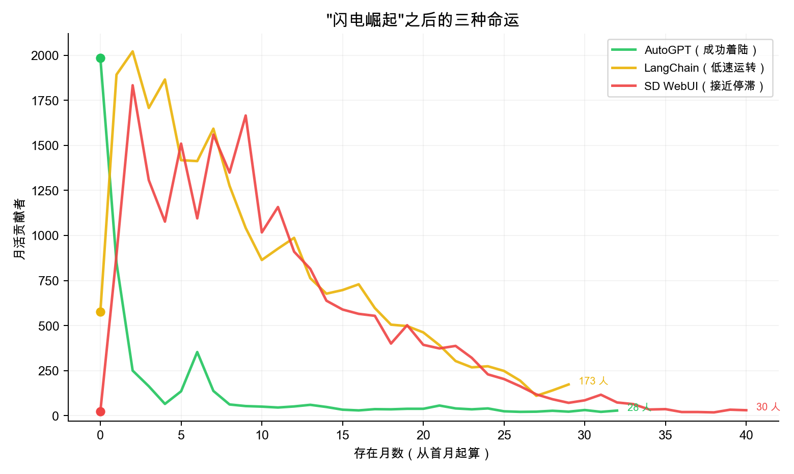
The iron law of “easy to explode, hard to sustain” doesn’t change just because of AI Agents. Among the 74 projects, others with similar explosions include Stable Diffusion WebUI (October 2022 peak of 1,834 MAU → only 30 by end of 2025, near stagnation) and LangChain (September 2023 peak of 2,022 MAU → only 173 by 2025, running on low power). Three paths lie ahead:
| Fate | Representative | Key Difference |
|---|---|---|
| Successful Landing | AutoGPT | Rebuilt core team after decline, talent returned to positive growth |
| Low-Power Operation | LangChain | Scale contracted 91%, but collaboration structure remains (clustering coefficient 0.15-0.27) |
| Near Stagnation | SD WebUI | Maintained by few, collaboration network becoming sparse |
Can OpenClaw avoid SD WebUI’s fate and replicate AutoGPT’s “landing”? The key lies in whether it can convert the first-month influx of participants into stable core contributors over the next 6 months.
3. Next.js: Hot Front-End Framework, Atmosphere Dimension Needs Work
| Dimension | Next.js | Contrast: DuckDB |
|---|---|---|
| Atmosphere Score | 21.7 (#73) | 100.0 (#1) |
| Toxicity Rate | Peak 17.68% | 0.0% |
| Overall Rank | #62 (50.2) | #37 (64.5) |
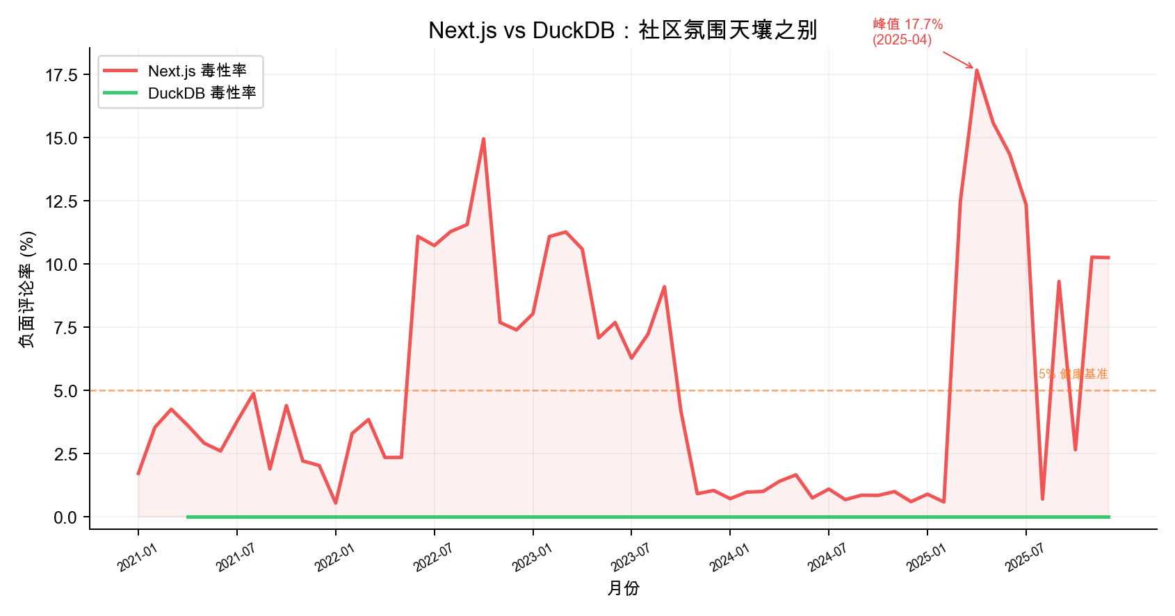
Vercel’s flagship project Next.js has 130K+ Stars, and its position in the front-end ecosystem needs no elaboration. But its community atmosphere score is only 21.7 (out of 100), ranking second-to-last among 74 projects.
The main reason is rising negative comment ratio. Using the ToxiCR model, we scanned 6.74 million comments on Next.js and found its toxicity rate rose from ~2% in mid-2022 to 15%, reaching 17.68% in April 2025 — well above the 5% healthy baseline.
By contrast, DuckDB’s toxicity rate has remained at 0.0% with a perfect atmosphere score. DuckDB has only 100-180 monthly active users, but the community has virtually no negative interactions. This is a “small but refined” technology-driven community — modest in scale, but exceptionally high in collaboration quality.
Takeaway: Community scale and community quality are two different dimensions. Large projects without effective community management may see negative interactions affect contributor willingness to participate, creating a vicious cycle.
Method at a Glance: Health Checks on Time-Series Collaboration Graphs
We built three types of monthly graphs from GitHub Archive’s full event data:
- Actor-Actor Collaboration Graph: PR merges, code reviews, Issue discussion relationships between developers, used to identify core developers and calculate collaboration density
- Actor-Repo Contribution Graph: Developer-to-repository contribution relationships, used to track cross-project talent flow
- Actor-Discussion Participation Graph: Developer-to-Issue/PR participation relationships, used to evaluate community atmosphere
We extracted monthly time series from these graphs using topological metrics like weighted degree centrality, k-core decomposition, BFS shortest path, and clustering coefficient, then performed “long-term trend + fluctuation stability” two-layer analysis on the sequences to synthesize four dimension scores (each weighted 25%).
| Dimension | What It Measures | Key Graph Metrics |
|---|---|---|
| Maintainer Burnout Risk | Whether core maintainers are declining | k-core decomposition, clustering coefficient, Bus Factor |
| Newcomer Friendliness | Whether newcomers can reach the core circle | BFS shortest path, core unreachable rate |
| Community Atmosphere | Communication quality and response efficiency | Toxicity detection (ToxiCR), response time, closure rate |
| Personnel Flow | Whether the talent pool is growing or shrinking | Annual net growth rate trend |
Advice for Different Readers
Technology Evaluators: When adopting AI application-layer frameworks, don’t be blinded by Star count. Check Issue closure rate and core contributor count — if core maintainers are fewer than 3, or if there’s been net personnel outflow for 2 consecutive years, evaluate alternatives. Prioritize dependency on infrastructure layers (PyTorch, Elasticsearch) rather than orchestration layers (LangChain, AutoGen).
Community Managers: Shift from “attracting eyeballs” to “filtering core contributors.” Elasticsearch’s counter-cyclical growth proves that a mature project’s core competitiveness isn’t widening the funnel mouth, but optimizing the funnel neck — making capable contributors enter the core layer more smoothly. Watch personnel flow trends — sustained talent outflow over 2-3 years is an earlier warning signal than Star count decline.
Open Source Contributors: Prioritize joining projects with high network clustering coefficient and stable core layers (PyTorch, Rust, Kubernetes). The deep collaboration relationships you build in these projects have far stronger cycle-crossing capability than mastering any single application-layer framework.
This study is based on GitHub Archive full data from 2021-2025, covering 74 projects, 60 months, and 6.74 million comments. All graph data storage and analysis were powered by NeuG embedded graph database. For complete methodology, scoring criteria, and raw data, see the full report.